Performance Metrics
Contents
Performance Metrics#
How to evaluate the performance of a machine learning algorithm?
How to detect the presence of underfitting or overfitting?
How to tune the algorithm to get a good fit?
Cross-validation#
In supervised machine learning, we have access to data containing labels, i.e. the input features have associated targets. Whether it is regression or classification, we know the answer. To assess how the model will deal with new cases, we need to compare its predictions with the answers. We cannot perform this comparison if we don’t have the labels! To cope, the input data set is split into different data subsets, each corresponding of a step in the optimization workflow:
Definition 26
The training set is a subset of the input data dedicated to the fitting procedure to find the model parameters minimizing the cost function (step 1).
The validation set is used to assess the performance of the model and tune the model’s hyperparameters (step 2).
The model is iteratively trained using only the training set, then validated using only the validation test until a given satisfying performance is achieved.
The test set is the final assessment done on the model; the resulting error rate on the test set is called generalization error, an estimate on the errors for future predictions with new data samples (step 3).
The general split between the training, validation and test subsets is 60%, 20% and 20% respectively. But depending on the number of samples, a smaller test set is sufficient. Reducing it allows for an increase of the training and validation set sizes, exposing the model to more data samples for training and validation.
Warning
The terms validation and test are sometimes interchangeably used both in industry and in academia, creating some terminological confusion. What is important to keep in mind is that once the iterative back-and-forth of steps 1 and 2 are giving a most performing model, the hyperparameters of the model are frozen and the last check, step 3, is done on not-yet-seen data with those hyperparameters.
TL;DR: Never use the final test data for tuning.
Data sets are split randomly, by shuffling the data rows and cutting and taking the table indices corresponding to the relative split between the three sub-collections. But precious information is lost by not training on the entire data samples available. Moreoever, one of the subset could pick more random outliers or noisy features that will deteriorate either the training or validation outcomes. To cope with this, a commonly used technique is to use the training set as validation set and vice versa, then pick the best performing outcome (set of hyperparameters). For instance if the entire data sample is split in terms of train/validate/test as A/B/C/D, with D the final test set, the cross-validation would consist of:
training with sets (BC) and validate with set A
training with sets (CA) and validate with set B
training with sets (AB) and validate with set C
In this example, we have a train/validate split of three sub-sets, we talk of a 3-fold cross-validation. The general name with \(k\) sub-sets is \(k\)-fold cross-validation.
Definition 27
The \(\mathbf{k}\)-fold cross-validation is a procedure consisting of using \(k\) subsets of the data used for the training and validation steps where each subset is rotationally used as the validation set, while the \(k-1\) other subsets are merged as one training set.
The \(k\) validation results are combined to provide an estimate of the model’s predictive performance.
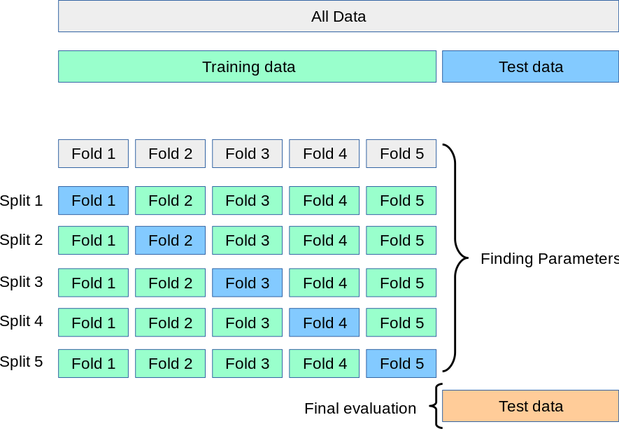
Fig. 24 . Illustration of the \(k\)-fold cross-validation on the training dataset.
Source: Scikit-Learn#
With \(k\)-fold cross-validation, the estimate of the model’s predictive performance comes with a precision (the standard deviation from the collection of \(k\) estimates). However cross-validation necessitates more computing time yet it is more robust against noise or outliers picked by the random splitting.
We now know how to manipulate our data set to get an estimate of performance. But what is this quantifier exactly? How to visualize it?
Types of errors#
Generally speaking, an error is the gap between the prediction and the true value. There are different terms depending on the algorithm and the set on which errors are computed.
For regression algorithms#
Definition 28
A residual is the difference between the actual and predicted value computed with respect to data samples used to train, validate and tune the model (i.e. in-sample error).
It is always a good practice to make a scatter plot of all the residuals with respect to the independent variable values; they should be randomly distributed on a band symmetrically centered at zero. If not, this means the chosen model is not appropriate to correctly fit the data.
Definition 29
The generalized error is the error rate of the difference between the actual and predicted values computed with respect to test or new data (i.e. out-of-sample error).
For classification algorithms#
In classification, the errors bear different names. As we saw that multiclassifiers are treated as a collection of binary classifiers, we will go over the two types of errors. The most common metric is the root mean squared error (RMSE).
Recall than the labelling and numerical association (1 and 0) of classes is arbitrary. Signal can be the rare process we want to see in the detector and 0 the background we want to reject. But we could exchange the numbers with 0 and 1, provided we remain consistent. In medical diagnosis, the class labelled 1 can be the presence of cancer on a patient (it’s not what we want of course, but what we are looking to classify).
Definition 30
The confusion matrix is a table used to visualize the prediction results (positive/negative) from a classification algorithm with respect to their correctness (true/false).
It is a \(n^C \times n^C\) matrix, with \(n^C\) the number of classes.
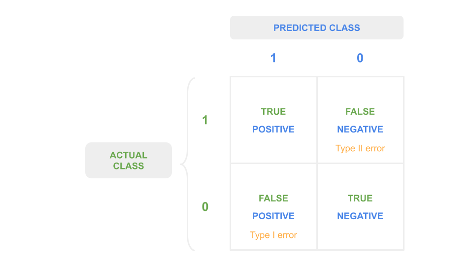
Fig. 25 . The confusion matrix for a binary classifier.
Image from the author#
The quantity in each cell \(C_{i,j}\) corresponds to the number of observations known to be in group \(i\) and predicted to be in group \(j\). The true cells are along the diagonal when \(i=j\). Otherwise, if \(i \neq j\), it is false. For \(n^C =2\) there are two ways to be right, two ways to be wrong. The counts are called:
\(C_{0,0}\): true negatives
\(C_{1,1}\): true positives
\(C_{0,1}\): false positives
\(C_{1,0}\): false negatives
Here is a rephrase in the context of event classification: signal (1) versus background (0).
True positives
We predict signal and the event is signal.
True negatives
We predict background and the event is background.
False positives
We predict signal but the event is background: our signal samples will have background contamination.
False negatives
We predict background but the event is signal: we have signal contamination in the background but most importantly: we missed a rare signal event!
The false positive and false negatives misclassifications are also referred to as type I and type II errors respectively. There are usually phrased using statistical jargon of null hypothesis (background) and alternative hypothesis (signal). The definitions below merge the statistical phrasing with our context above:
Definition 31
Type I error - False Positive
Error of rejecting the null hypothesis when the null hypothesis is true.
\(\Rightarrow\) Background is classified as signal (background contamination)
Type II error - False Negative
Error of accepting the null hypothesis when the alternative one is actually true.
\(\Rightarrow\) Signal is classified as background (missing out on what we look for)
The type I error leads to signal samples not pure, as contaminated with background. But a type II error is a miss on a possible discovery! Or in medical diagnosis, it can be equivalent to state “you are not ill” to a sick patient. Type II errors are in some cases and contexts much worse than type I errors.
Performance measures#
For regression algorithms#
There are many metrics used to evaluate the performance of regression algorithms, each with theirs pros and cons.
Definition 32
The root mean squared error (RMSE) is the square root of the mean squared error:
RMSE ranges from 0 to infinity. The lower the RMSE, the better. By taking the square root we have an error of the same unit that the target variable \(y\) we want to predict.
You may have seen in a statistics course the coefficient of determination, called \(R^2\) or \(r^2\). This is not really a measure of model performance, although it can be used as a proxy. What \(r^2\) does is to measure of the amount of variance explained by the model. It is more a detector of variance than a performance assessment. Ranging from 0 to 1, with 1 being ideal.
For classification algorithms#
The total model error, i.e. the sum of all wrong predictions divided by the total number of predictions, is not a good metric as it mixes types I and II errors. There are other error measurements more appropriate to measure the performance for classification. The more popular ones associated with machine learning are defined below:
Definition 33
Accuracy
Rate at which the model is able to predict the correct values of both classes.
Precision, or Positive Predictive Value (PPV)
Measure of the fraction of true predictions among all positive predictions.
Recall, or True Positive Rate (TPR)
Measure of the fraction of true predictions among all true observations.
F-Score, or F1
Describes the balance between Precision and Recall. It is the harmonic mean of the two:
The F-Score is a single metric favouring classifiers with similar Precision and Recall. But in some contexts, it is preferrable to favour a model with either high precision and low recall, or vice versa. There is a known trade-off between precision and recall.
In case of unbalanced dataset
In an unbalanced dataset, some classes will appear much more frequently that others. A specific metric called balanced accuracy is used to assess the performance in that case.
Definition 34
Balanced accuracy is calculated as the average of recall obtained on each class.
Exercise
Find different examples of classification in which:
a low recall but high precision is preferrable
a low precision but high recall is preferrable
The ROC curve and the area under it#
Ingredients to ROC#
There is in machine learning a very convenient visual to not only see the performance of a binary classifier but also compare different classifiers between each others. It is the ROC curve (beloved by experimental particle physicists). Before explaining how to draw it, let’s first introduce key ingredients. Those ingredient are concepts previously encountered, yet but baring other names: the score and decision threshold.
We saw the classification is done using the output of the sigmoid function and a decision boundary of \(y=0.5\) (see Definition 18 in section What is the Sigmoid Function?). Sometimes the classifier’s output is also called score, aka an estimation of probability, and the decision boundary can be also referred to decision threshold. It’s a cut value above which a data sample is predicted as a signal event (\(y=1\)) and below which it is classified as background (\(y=1\)). We chose \(y^\text{thres.}=0.5\) to cut our sigmoid half way through its output range, but for building a ROC curve, we will vary this decision threshold.
Now let’s recall (pun intended) the True Positive Rate that was defined above in Definition 33, but let’s write it again for convenience and add other metrics:
Definition 35
True Positive Rate (TPR), also called recall and sensitivity
True Negative Rate (TNR), also called specificity
Ratio of negative instances correctly classified as negative.
False Positive Rate (FPR)
Ratio of negative instances that are incorrectly classified as positive.
The False Positive Rate (FPR) is equal to:
In particle physics, the True Positive Rate is called signal efficiency. It is indeed how efficient the classifier is to correctly classify as signal (numerator) all the real signal (denominator). Zero is bad, TPR = 1 is ideal. The True Negative Rate is called background efficiency. Particle physics builds ROC curves slightly different than the ones you can see in data science; instead of using FPR it uses the background rejection, defined as the inverse of background efficiency.
We have our ingredients. So, what is a ROC curve?
Building the ROC curve#
Definition 36
The Receiver Operating Characteristic (ROC) curve is a graphical display that plot the True Positive Rate (TPR) against the False Positive Rate (FPR) for each value of the decision threshold \(T\) going over the classifier’s output score range.
A picture is worth a thousand words as we say. Let’s make sense of the definition above using the illustration below:
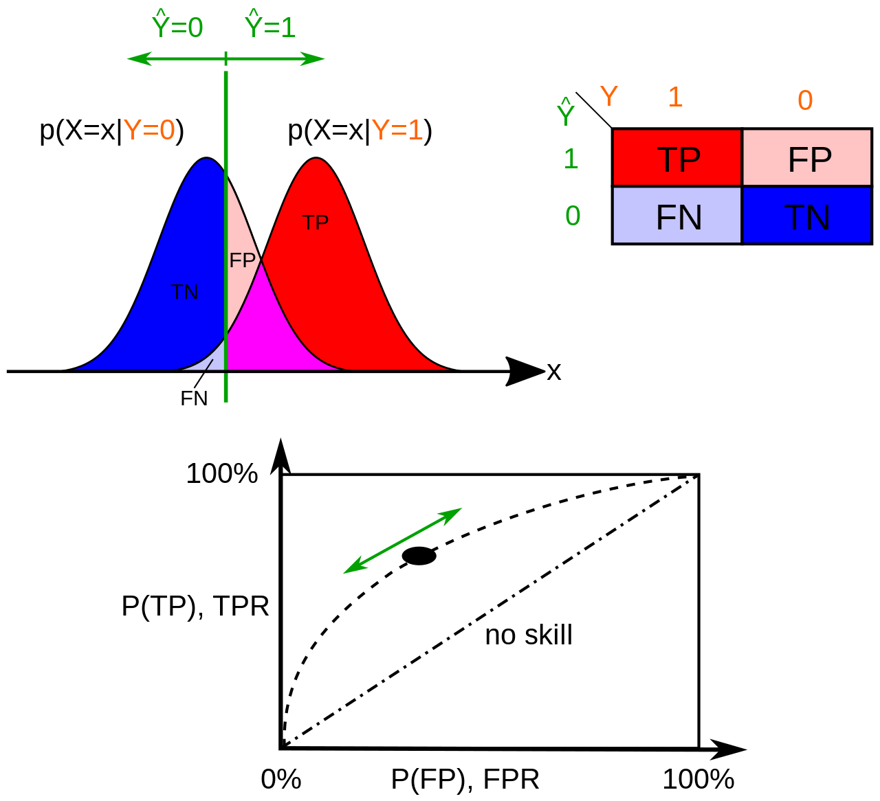
Fig. 26 . How a ROC curve is constructed: the continuous variable \(x\) represents the classifier’s score. For a given decision threshold (green), the probabilities of True Positive P(TP) and False Positive P(FP) (or their equivalent in rates) are computed and plotted in the graph below. The ROC curve is the ensemble of the points (TPR, FPR) for the threshold spanning all the values of \(x\).
Image: Wikipedia#
In the picture above, there are two histograms obtained from the classifier’s score distribution using background (blue, \(y=0\)) and signal (red, \(y=1\)) samples. The True Positive Rate or signal efficiency is the integral of the signal (red) score distribution from the threshold \(T\) to the right (\(x \to +\infty\)) divided by the entire integral of the signal (red) distribution. The False Positive Rate can be obtained in two ways:
We take the integral of the background (blue) distribution from the threshold \(T\) to the left (\(x \to -\infty\)) and divide by the full background distribution’s integral. That’s the background efficiency, or TNR. Then we get FPR using FPR = 1 - TNR.
Or:
We take the integral of the background (blue) distribution from the threshold \(T\) to the right (\(x \to +\infty\)) and divide by the full background distribution’s integral.
Exercise
If we move the threshold \(T\) to the right (\(x \to +\infty\)), in which direction would it corresponds to on the ROC curve? Right or left?
Check your answer
If we move the threshold \(T\) to the right, we will omit some signal samples (\(y=1\)) and thus decrease in signal efficiency, so the True Positive Rate will decrease (and if we exagerate to check this reasoning by pushing \(T\) to the very very right, we have no more signal sample on the right of the threshold, we miss out all signal and TPR = 0). So moving to the right decreases the signal efficiency/TRP.
What about background (\(y=0\))? It’s the contrary, if we shift the threshold \(T\) to the right, we will gain more background samples in the blue distribution and improve our background efficiency. Good for the background, but we want signal. That translates on the ROC curve in reducing the FPR (1 - background-efficiency). And we can check that if the threshold is all the way to the right, we have 100% background efficiency and a specificity of zero.
Conclusion: increasing the decision threshold \(T\) moves us on the ROC curve to the left (and down eventually to 0,0).
Comparing Classifiers#
The ROC has the great advantage to see how different classifiers compare through all the ranges of signal and background efficiencies.
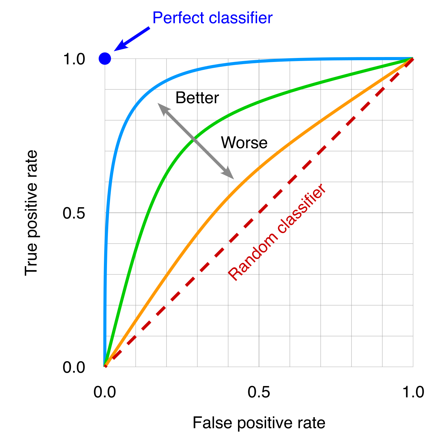
Fig. 27 . Several ROC curves can be overlaid to then compare classifiers. A poor classifier will be near the random classifier line, which is the “random classifier” or in other words using pure luck (it will be right on average 50% of the time). The idea classifier correspond to the top left dot, where 100% of the signal sample are correctly classified so the False Positive Rate is zero.
Image: Modified work by the author, original by Wikipedia#
We can see from the picture that the more the curve approaches the ideal classifier, the better it is. We can use the area under the ROC curve to have a single number to then quantitatively compare classifier on the whole.
Definition 37
The Area Under Curve (AUC) is the integral of the ROC curve, from FPR = 0 to FPR = 1.
A perfect classifier will have AUC = 1.
Warning
While it is convenient to have a single number for comparing classifier, the AUC is not reflecting how classifiers perform for specific ranges of signal efficiencies. It is always important while optimizing or choosing a classifier to check its performance in the range relevant for the given problem.
Bias and Variance#
Definitions#
The generalization error can be expressed as a sum of three errors:
The two first are reducible. In fact, we will see in the following how to reduce them as much as possible! The last one is due to the fact data is noisy itself. It can be minimized during data cleaning by removing outliers (or more upfront by improving the detector or device that collected the data).
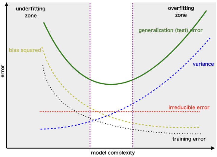
Fig. 28 . Decomposition of the generalized error into the bias, variance and irreducible errors.
Image: towardsdatascience.com#
Increasing the model complexity will reduce the bias but increase the variance. Reversely, simplifying a model to mitigate the variance comes at a risk of a higher bias. In the end, the lowest total error is a trade-off between bias and variance.
Definition 38
The bias is an error coming from wrong assumptions on the model.
A highly biased model will most likely underfit the data.
The bias implies not grasping the full complexity of the situation (think of a biased person making an irrelevant or indecent remark in a conversation).
Definition 39
The variance is a measure of the model’s sensitivity to statistical fluctuations of the training data set.
A model with high variance is likely to overfit the data.
As its name suggest, a model incorporating fluctuations in its design will change, aka vary, as soon as it is presented with new data (fluctuating differently).
Using a larger training dataset will reduce the variance.
Below is a good visualization of the two tendencies for both regression and classification:
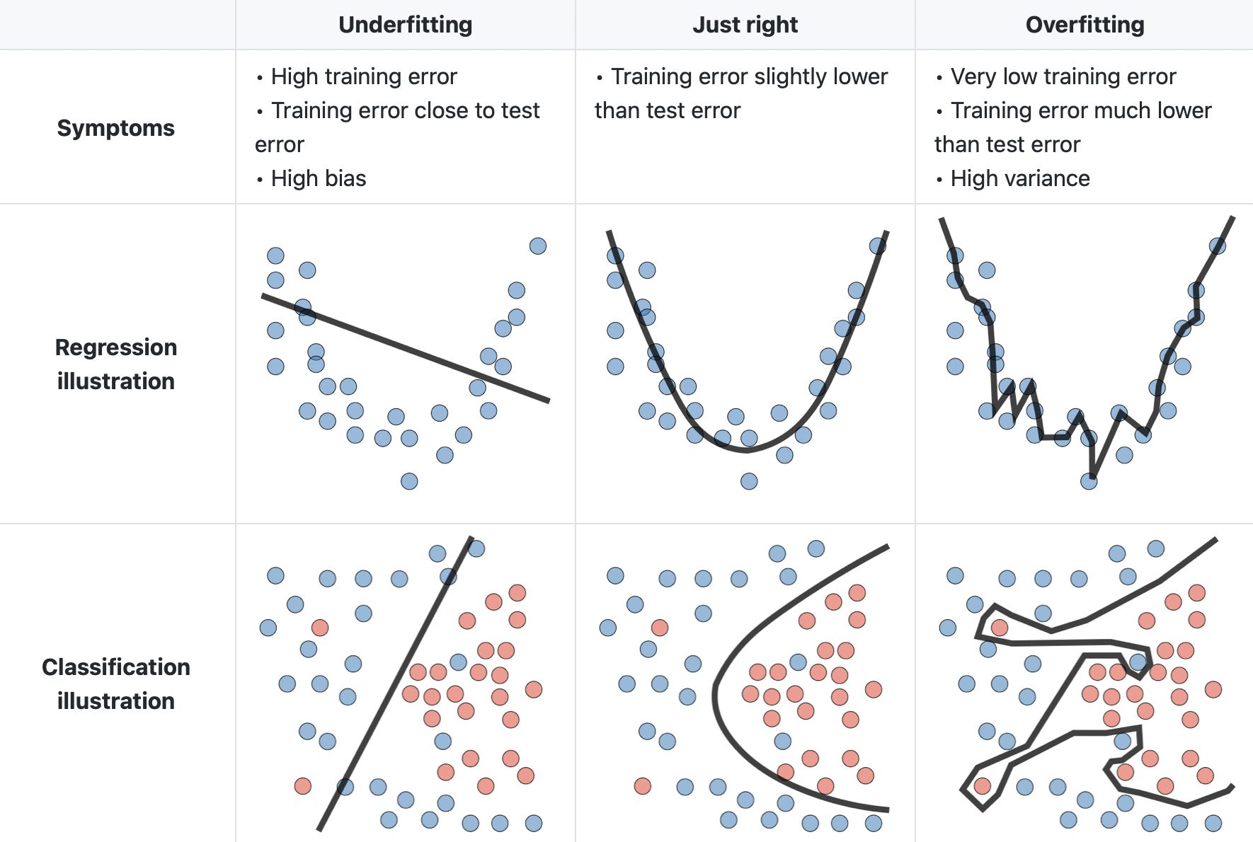
Fig. 29 . Illustration of the bias and variance trade-off for regression and classification.
Image: LinkedIn Machine Learning India#
Before learning on ways to cope with either bias or variance, we need first to assess the situation. How to know if our model has high bias or high variance?
Identifying the case#
By plotting the cost function \(J(\theta)\) with respect to the model’s complexity. Increasing complexity can be done by adding more features, higher degree polynomial terms, etc. This implies running the training and validation each time with a different model to collect enough points to make such a graph:
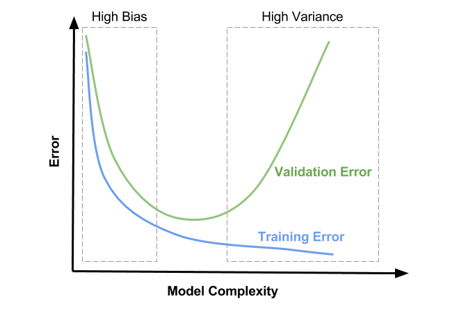
Fig. 30 . Visualization of the error (cost function) with respect to the model’s complexity for the training and validation sets. The ideal complexity is in the middle region where both the training and validation errors are low and close to one another.
Image: David Ziganto#
It can impractical to test several models with higher complexity. More achievable graphs would be to plot the error (cost function) with respect to the sample size \(m\) or the number of epochs \(N\):
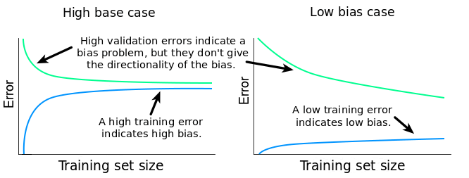
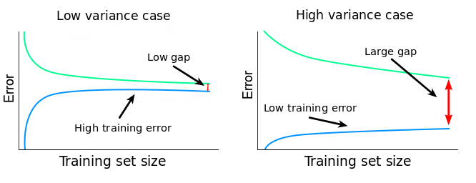
Fig. 31 . Interpretation of the error plots as a function of the number of samples in the dataset for low and high bias/variance situations.
Images: dataquest.io#
The presence of a small gap between the train and test errors could appear like a good thing. But it important to quantify the training error and relate it to the desired accuracy: if the error is much higher than the irreducible error, chances are the algorithm is suffering from a high bias.
The variance is usually spotted by the presence of a significant gap pertaining even if the dataset size \(m\) increases, yet closing itself for large \(m\) (hint for the following section on to cope with variance: getting more data).
How to deal with bias or variance#
The actions to perform to mitigate either bias or variance once we have diagnosed the situation can be done on the dataset, on the model itself and on the regularization. The table below summarizes the relevant treatments to further optimize your machine learning algorithm in the good direction.
Action categories |
Reducing Bias |
Reducing Variance |
|---|---|---|
On the dataset |
Adding more (cleaned) data |
|
On the model |
Adding new features and/or polynomial features |
Reducing the number of features |
Regularization |
Decreasing parameter \(\lambda\) |
Increasing parameter \(\lambda\) |
The tutorials will offer a good training for you (and validation ;) ) to diagnose and correctly optimize your machine learning algorithm.