‘Forestree’ with LHC collisions
Contents
2. ‘Forestree’ with LHC collisions#
Learning Objectives
In this tutorial, you will learn how to classify collisions from the Large Hadron Collider using decision trees and random forests.
Main goals:
Implement a decision tree
Compute by hand performance metrics
Compare decision trees by changing hyperparameters
Implement a random forest classifier
Visualize the decision surface
Plot a ROC curve and compare different classifiers’ performance
What will also be covered:
How to load and explore a dataset
How to plot with Matplotlib
How to define custom functions
How to debug a code
If time allows:
How to use AdaBoost
Let’s now open a fresh Jupyter Notebook and follow along!
Introduction
Higgs boson production modes
In particle physics, the Higgs boson plays an essential role, in particular (pun intended) it gives massive particles their observed mass. The Higgs boson can be produced in different ways - we call this “Higgs boson production mechanism.” The main two production processes are:
gluon-gluon Fusion (ggF): two gluons, one from each of the incoming LHC protons, interact or “fuse” to create a Higgs boson.
Vector Boson Fusion (VBF): a quark from each of the incoming LHC protons radiates off a heavy vector boson (\(W\) or \(Z\)). These bosons interact or “fuse” to produce a Higgs boson.
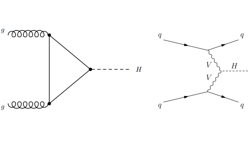
Fig. 2.1 . Feynman diagrams for the gluon-gluon Fusion (ggF) process on the left and Vector Boson Fusion (VBF) on the right.
Image: ATLAS, CERN#
The latter process, VBF, is very interesting to study as it probes the coupling between the Higgs boson and the two other vector bosons. This is seen on the Feynman diagram with the vertex between the two departing wavy branches of each vector boson V and the dashed line H representing the Higgs boson. Such configuration is said to be “sensitive to new physics”, because there can be processes that are not part of the current theory, the Standard Model, arising there. Hence the importance to measure the rates of VBF collisions (how frequent does it happen). But before, how to select the Higgs boson VBF production from the other one, gluon-gluon Fusion?
Inside the Data
This tutorial will use ATLAS Open Data, which provides open access to proton-proton collision data at the LHC for educational purposes.
In the VBF process, the initial quarks that first radiated the vector bosons are deflected only slightly and travel roughly along their initial directions. They are then detected as particle “jets” in the different hemispheres of the detector. Jets are reconstructed as objects. Although they are more of a conical shape, they are stored in the data as a four-vector entity, with a norm, two angles and an energy.
The collisions have been filtered to select those containing each a Higgs boson, four leptons and at least two jets.
We will focus on two variable for now:
\(|\Delta\eta_{jj}|\): it corresponds to the angle between the two jets (\(\eta\) is the pseudorapidity)
\(m_{jj}\): the invariant mass of the two jets
These variable are already calculated in the data samples.
2.1. Explore the Data#
2.1.1. Get the Data#
The datasets can be found here. Download the files and put them in your GDrive.
To load the data on Google Colab, you will need to run a cell with these lines:
from google.colab import drive
drive.mount('/content/gdrive')
Then using !ls you can get the path where the data files are located.
Before playing with the data, let’s import libraries.
import os, sys
import pandas as pd
import numpy as np

# set a seed to ensure reproducibility
seed = 42
rnd  = np.random.RandomState(seed)

# Matplotlib plotting settings
import matplotlib as mp
import matplotlib.pyplot as plt
%matplotlib inline
print('matplotlib version: {}'.format(mp.__version__))

FONTSIZE = 16
params = {
         'axes.labelsize': FONTSIZE,
         'axes.titlesize': FONTSIZE,
         'xtick.labelsize':FONTSIZE,
         'ytick.labelsize':FONTSIZE}
plt.rcParams.update(params)
Question 1.0: Get the data
Use pd.read_csv to store each dataset into a dataframe. Name them train, valid and test respectively.
Explore the variables by printing the first five rows.
The sample column stores the labels of the collisions: +1 corresponds to VFB and -1 to ggF.
Question 1.1: Inspect the data. How many events (rows) does each file contain?
Question 1.2: How many events of each process (VFB and ggF) does each file contain?
Ask for hint(s) to the instructor if you are stuck.
2.1.2. Visualize the Data#
Let’s draw a scatter plot to see how the data look like! But first, we will create reduced dataset with only the necessary variables. Copy the following in your notebook:
# GLOBAL VARIABLES
XNAME = 'detajj'; XLABEL = r'$|\Delta\eta_{jj}|$'
YNAME = 'massjj'; YLABEL = r'$m_{jj}$ (GeV)'

inputs= [XNAME, YNAME] ;

XBINS = 5 ; XMIN = 0 ; XMAX = 5    ; XSTEP = 1
YBINS = 5 ; YMIN = 0 ; YMAX = 1000 ; YSTEP = 200

# Creating reduced datasets with detajj & massjj only
X_train = train[inputs] ; y_train = train['sample']
X_valid = valid[inputs] ; y_valid = valid['sample']
X_test  =  test[inputs] ; y_test  =  test['sample']
The plotting macro is given, but you will have to modify it later:
def plot_scatter(sig, bkg,
              xname=XNAME, xlabel=XLABEL, xmin=XMIN, xmax=XMAX, xstep=XSTEP,
              yname=YNAME, ylabel=YLABEL, ymin=YMIN, ymax=YMAX, ystep=YSTEP,
              fgsize=(6, 6), ftsize=FONTSIZE, alpha=0.3, title="Scatter plot"):

  fig, ax = plt.subplots(figsize=fgsize)

  # Annotate x-axis
  ax.set_xlim(xmin, xmax)
  ax.set_xlabel(xlabel)
  ax.set_xticks(np.arange(xmin, xmax+xstep, xstep))

  # Annotate y-axis
  ax.set_ylim(ymin, ymax)
  ax.set_ylabel(ylabel)
  ax.set_yticks(np.arange(ymin, ymax+ystep, ystep))

  # Scatter signal and background:
  ax.scatter(sig[xname], sig[yname], marker='o', s=15, c='b', alpha=alpha, label='VBF')
  ax.scatter(bkg[xname], bkg[yname], marker='*', s= 5, c='r', alpha=alpha, label='ggf')

  # Legend and plot:
  ax.legend(fontsize=ftsize, bbox_to_anchor=(1.04, 0.5), loc="center left", frameon=False)
  ax.set_title(title, pad=20)
  plt.show()
Question 1.3: Make a scatter plot of the training data , with \(|\Delta\eta_{jj}|\) on the \(x\)-axis and \(m_{jj}\) on the \(y\)-axis. You will have to split the data sample in signal (VBF) and background (ggF).
2.2. Decision Tree#
Let’s use Scikit-Learn to make a first shallow decision tree.
from sklearn import tree
from sklearn.tree import export_text
Question 2.1: Make a decision tree with a maximum depth of 2.
Question 2.2: Plot the tree using tree.plot_tree command, with the filled option activated.
You will see something like this:
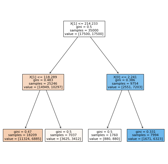
Fig. 2.2 . Representation of the Decision Tree.
Image: from Scikit-Learn tree library#
Question 2.3: Comment the tree.
Describe what is this representation about. How are the variables encoded in Scikit-Learn? Which direction (left/right) chosen if the condition is true/false? What does the colouring in some nodes correspond to? Where goes the signal, where goes the background? Which leaves are the purest? For which category?
Question 2.4: Calculate the accuracy from the numbers displayed in the leaves.
Detail your calculations.
2.3. Performance metrics#
We will compute some metrics by hand and compare with Scikit-Learn predefined methods. As a start, the Confusion Matrix from Scikit-Learn will help us. Let’s first import the library:
from sklearn import metrics
The way the confusion matrix is called is:
cm = metrics.confusion_matrix(y_obs, y_preds)
disp = metrics.ConfusionMatrixDisplay(confusion_matrix=cm)
disp.plot()
plt.show()
Questions 3.1: Confusion Matrix
Using the predict() method on your classifier, write the code to show the confusion matrix.
Question 3.2: Comment it
How is the confusion matrix encoded in Scikit-Learn? Is it the same as in the lecture? Find and explain in which cells are the True Positives (TP), True Negatives (TN), False Positive (FP) and False Negatives (FN).
Question 3.3: Function to print metrics and compare with Scikit-Learn
You will write a function print_metrics that extract the TP, TN, FP, FN from the confusion matrix. It should then print:
The accuracy
The True Positive Rate (TPR)
The True Negative Rate (TNR)
The False Positive Rate (FPR)
A skeleton is provided below. Complete it according to the instructions above. Choose the proper labels for LABEL1 and LABEL2 at the end of the provided code.
def print_metrics(clf, X, y_obs, printCM=False, title="Classifier Performance"):

    #____________________

    # Your code here

    #____________________

    print(f"\n{title}\n")
    print(f"Accuracy: {acc:.3f}")
    print(f"     TPR: {TPR:.3f}")
    print(f"     TNR: {TNR:.3f}")
    print(f"     FPR: {FPR:.3f}")

    # Check Scikit-Learn (SL)
    acc_SL = metrics.accuracy_score(y_obs, y_preds)
    TPR_SL = metrics.recall_score(y_obs, y_preds)
    print(f"Check: Scikit-Learn accuracy: {acc_SL:.3f} \t Recall (TPR): {TPR_SL:.3f}")

    if printCM:
        disp = metrics.ConfusionMatrixDisplay(confusion_matrix=cm, display_labels=['LABEL1', 'LABEL2'])
        disp.plot()
        plt.show()
Call your function with the train and test datasets (change the title accordingly).
Question 3.4: How does the performance change when assessed on the test dataset? Which error type is the highest?
2.4. ROC The Tree#
Let’s use Scikit-Learn metrics to get the ingredients to plot a ROC curve. We need continuous probabilities. How are probabilities calculated? Let’s show the first 5 entries of X_train. Recall the decision tree (Figure Fig. 2.2) we plotted above.
X_train[:5]
The probability is defined as “the fraction of samples of the same class in a leaf”. (source: Scikit-Learn predict_proba function).
Q 4.1: What are the signal probabilities for the first five entries?
Hint: first, find for each event in which leaf it falls according to the input values.
Q 4.2: Check your answers with predict_proba and explain the output array
y_scores_train = clf.predict_proba(X_train)
y_scores_train[:5]
ROC Curve
Below is a macro to plot the ROC curve. You will have to complete it on your notebook. Look in the documentation of Scikit-Learn to see which function to call and how to use it.Note: The classindex is the index of the positive class on the score array (first position is index 0, second is 1, etc).
def plot_ROC_curve(clf, label_leg, X, y_obs, class_index):

  fig, ax = plt.subplots(figsize=(6,6))

  # Luck line
  ax.plot([0, 1], [0, 1], color="navy", lw=2, linestyle="--")

  # Get proba predictions:
  y_scores = clf.predict_proba(X)

  # Getting the ROC curve values
  fpr = dict() ; tpr = dict()

  #_____________________________

  # Your code here (2 lines)

  #_____________________________

  ax.set_xlim([0, 1]) ; ax.set_ylim([0, 1])
  ax.grid(color='grey', linestyle='--', linewidth=1)
  ax.set_xlabel("False Positive Rate")
  ax.set_ylabel("True Positive Rate")
  ax.set_title("ROC Trees", pad=20)

  # Legend and plot:
  ax.legend(fontsize=FONTSIZE, bbox_to_anchor=(1.04, 0.5), loc="center left", frameon=False)
  plt.show()
Call the function with your classifier. For the legend you can write “Decision Tree Depth 2” (we will increase the depth soon).
Let’s now make a decision tree very deep, of depth 20. Create a new classifier:
tree_clf_depth20 = tree.DecisionTreeClassifier(max_depth = 20 )
tree_clf_depth20.fit(X_train, y_train)
Use your function print_metrics to see the performance and plot its ROC curve.
Q 4.3: How does the performance of this tree compare with the shallow tree of depth 2? What is likely to happen here?
2.5. Decision Surface#
We can create a decision surface for a given classifier with two inputs. It is a representation of all the cuts done on the variables. For this, once we have trained a model, we use it to make predictions for a grid of values across the input domain. Here is the function to compute the values:
def get_decision_surface_xyz(clf, inputs, x_lims, y_lims, step):

  # Create all of the lines and rows of the grid
  xx, yy = np.meshgrid(np.arange(x_lims[0], x_lims[1]+step, step),
                         np.arange(y_lims[0], y_lims[1], step))

  # Creat dataframe with flattened (ravel) vectors:
  X = pd.DataFrame({inputs[0]: xx.ravel(), inputs[1]: yy.ravel()})

  # Get Z value vectors (ravel = flatten grid in vector)
  Z = clf.predict(X)

  # Reshape Z as grid for exporting
  zz = Z.reshape(xx.shape)

  # Return grid + surface values:
  return (xx, yy, zz)
Q 5.1: Draw the Decision Surface
First, add the code above in a new cell. Then, modify the plot_scatter function with these two additions:
add an optional argument
ds=Noneadd before the legend the following:
  # Decision surface
  if ds:
    (xx, yy, Z) = ds
    cs = plt.contourf(xx, yy, Z, colors=['red','blue'], alpha=0.3)
Call your function with your first classifier.
# Get values x,y,z of decision surface for classifier:
DS_xyz = get_decision_surface_xyz(tree_clf_depth2, inputs, [XMIN, XMAX], [YMIN, YMAX], 0.05)
# Plot scatter with decision surface:
plot_scatter(sig, bkg, DS_xyz, title="Decision Surface for DT Depth 2")
You should see something like that:
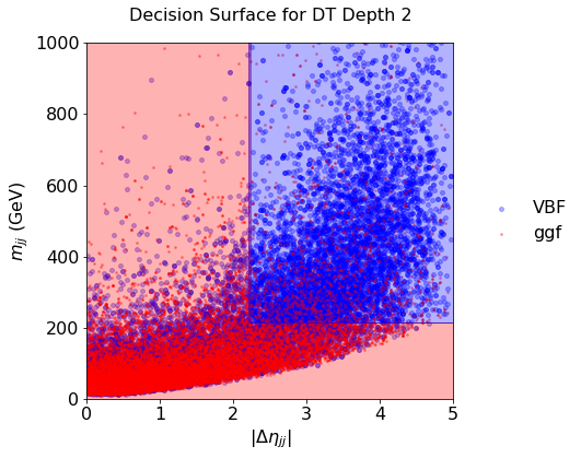
Fig. 2.3 . Decision Surface of a decision tree of depth 2.
Scikit-Learn#
Call it again with the tree of depth 20.
Q 5.2: Comment on the decision surface with the deep tree: what is happening? How to cope?
2.6. The Forest#
Let’s plant a forest now. We need the following imports:
from sklearn.ensemble import RandomForestClassifier
from pprint import pprint # 'pretty printing', for listing the parameters
Q 6.1: Create a random forest with the defaults Scikit-Learn settings and print the parameters
Q 6.2: How many estimators is the random forest made of?
Q 6.3: Plot the decision surface. How does it compare with one tree of depth 20?
Optional: you can plot the ROC curve of your forest classifier and compare with the tree ones. More on ROC curves at the end.
Q 6.4: Create and plot the decision surface of a forest with 100 estimators and a max depth of 5 for each.
2.7. Green Boost#
Let’s now boost! Recall the demo in Lecture 4. We will take 10 estimators of maximum depth 2:
from sklearn.ensemble import AdaBoostClassifier

ada_clf = AdaBoostClassifier(
    DecisionTreeClassifier(max_depth=2),
    n_estimators=10,
    algorithm="SAMME.R",
    learning_rate=0.5)

ada_clf.fit(X_train, y_train)
Q 7.1: How does it compare with the other classifiers?
See it on the decision surface!
2.8. Bonus: overlay ROC curves#
We plotted a ROC curve for each tree and random forest. It is convenient to overlay the ROC curves on the same graph to easily compare classifiers. For this, you can modify your ROC curve macro to loop over a dictionary of classifiers. Such a dictionary can look this way (example, you can code it differently of course):
clfs = [{'clf': tree_clf_depth2,  'name': 'Decision Tree Depth 2' ,                   'color':'brown'},
        {'clf': tree_clf_depth20, 'name': 'Decision Tree Depth 20',                   'color':'coral'},
        {'clf': RF_100est,        'name': 'Random Forest 100 estimators',             'color':'greenyellow'},
        {'clf': RF_100e_d5,       'name': 'Random Forest 100 estimators, max depth 5','color':'yellowgreen'},
        {'clf': ada_clf,          'name': 'AdaBoost 10 estimators, max depth 2',      'color':'green'}
]
2.9. Bonus of the Bonus#
If you manage to do everything above and are starting to get bored, come to me, I will give you a challenge.