T4. Forestry
Contents
T4. Forestry#
In this tutorial, you will get a hands-on feel for tree-based models, from single decision trees to ensembles like Random Forests and boosting methods. You will see how their performance compares across metrics and visualizations.
Learning Objectives
Gain familiarity with Scikit-Learn Decision Trees, Random Forests, and AdaBoost
Understand the effect of changing hyperparameters on the training
Compute by hand performance metrics
Visualize the decision surface
Plot a ROC curve and compare different classifiers’ performance
Introduction#
This tutorial is a follow-up to Tutorial 3. We use toy collision data inspired by the Large Hadron Collider, with the goal of selecting events corresponding to a particular Higgs boson production mode.
1. Get the data#
Here are the three datasets (again for convenience):
Use pd.read_csv to store each dataset into a dataframe. Name them train, valid and test respectively.
Explore the variables by printing the first five rows.
Reminder: the sample column stores the labels of the collisions: +1 corresponds to VFB and -1 to ggF.
1.1 Inspect the Data#
How many events (rows) does each file contain?
How many events of each process (VFB and ggF) does each file contain?
1.2 Visualize the Data#
Let’s draw a scatter plot to see how the data look like. Like in the previous tutorial, we will focus on two variables for now: \(|\Delta\eta_{jj}|\) on the \(x\)-axis and \(m_{jj}\) on the \(y\)-axis.
# Variables of interest
XNAME = 'detajj'; XLABEL = r'$|\Delta\eta_{jj}|$'
YNAME = 'massjj'; YLABEL = r'$m_{jj}$ (GeV)'

inputs = [XNAME, YNAME]

# Binning ranges
XBINS, XMIN, XMAX, XSTEP = 5, 0, 5, 1
YBINS, YMIN, YMAX, YSTEP = 5, 0, 1000, 200

# Split training data into signal and background
sig = ...
bkg = ...
Then pass sig and bkg to the plotting macro.
Hint
df.loc[rows, columns] lets you filter both rows and columns at the same time.
Call the macro from Appendix: T3 Snippet Zone and look at your data!
2. Decision Tree#
Let’s use Scikit-Learn to make a first shallow decision tree.
from sklearn import tree
from sklearn.tree import export_text
2.1 Grow a Tree#
Make a decision tree with a maximum depth of 2.
2.2 See your Tree#
Using the function tree.plot_tree from Scikit-Learn, visualize your trained tree. Call it with the filled option activated. You should see something like this:
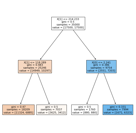
Fig. 60 . Representation of the Decision Tree.
Image: from Scikit-Learn tree library#
2.4 Accuracy#
In the next section, you will write functions to compute performance metrics. For now, let’s warm up: calculate (no code, just pen and paper) the accuracy from the numbers displayed in the leaves. For simplicity, keep using the training dataset.
3. Performance metrics#
We will now write functions that compute performance metrics by hand and compare them with Scikit-Learn’s predefined methods. As a start, the Confusion Matrix from Scikit-Learn will help us. Let’s first import the library:
from sklearn import metrics
The way the confusion matrix is called is:
cm = metrics.confusion_matrix(y_obs, y_preds)
disp = metrics.ConfusionMatrixDisplay(confusion_matrix=cm)
disp.plot()
plt.show()
3.1 Confusion Matrix#
Using the predict() method on your classifier, write the code to show the confusion matrix.
How is the confusion matrix encoded in Scikit-Learn? Is it the same as in the lecture? Find and explain in which cells are the True Positives (TP), True Negatives (TN), False Positive (FP) and False Negatives (FN).
3.2 Write Your Metrics (and compare)#
Let’s code it by hand here and then compare with Scikit-Learn.
You will write a function print_metrics that extract the TP, TN, FP, FN from the confusion matrix. Then calculate and print the following:
The accuracy
The True Positive Rate (TPR)
The True Negative Rate (TNR)
The False Positive Rate (FPR)
A skeleton is provided below. Complete it according to the instructions above. Choose the proper labels for LABEL1 and LABEL2 at the end of the provided code.
def print_metrics(clf, X, y_obs, printCM=False, title="Classifier Performance"):

    #____________________

    # Your code here

    #____________________

    print(f"\n{title}\n")
    print(f"Accuracy: {acc:.3f}")
    print(f"     TPR: {TPR:.3f}")
    print(f"     TNR: {TNR:.3f}")
    print(f"     FPR: {FPR:.3f}")

    # Check Scikit-Learn (SL)
    acc_SL = metrics.accuracy_score(y_obs, y_preds)
    TPR_SL = metrics.recall_score(y_obs, y_preds)
    print(f"Check: Scikit-Learn accuracy: {acc_SL:.3f} \t Recall (TPR): {TPR_SL:.3f}")

    if printCM:
        disp = metrics.ConfusionMatrixDisplay(confusion_matrix=cm, display_labels=['LABEL1', 'LABEL2'])
        disp.plot()
        plt.show()
Call your function with the train and test datasets (change the title accordingly).
3.3 Comment#
How does the performance change when assessed on the test dataset? Which error type is the highest?
4. ROC The Tree#
Let’s use Scikit-Learn metrics to get the ingredients to plot a ROC curve. We need continuous probabilities. How are probabilities calculated? Let’s show the first 5 entries of X_train. Recall the decision tree (Figure Fig. 60) we plotted above.
X_train[:5]
The probability is defined as “the fraction of samples of the same class in a leaf”. (source: Scikit-Learn predict_proba function).
4.1 Probabilities#
What are the signal probabilities for the first five entries?
Hint
First, find for each event in which leaf it falls according to the input values.
4.2 Check: Scikit-Learn’s Scores#
Check your answers with predict_proba and explain the output array__
y_scores_train = clf.predict_proba(X_train)
y_scores_train[:5]
ROC Curve
A macro to plot the ROC curve is provided in the Appendix: T4 Snippet Zone. You will have to complete it on your notebook. Look in the documentation of Scikit-Learn to see which function to call and how to use it.
Note
The classindex is the index of the positive class on the score array (first position is index 0, second is 1, etc).
Call the function with your classifier. For the legend, you can write “Decision Tree Depth 2” (we will increase the depth soon).
Let’s now make a decision tree very deep, of depth 20. Create a new classifier:
tree_clf_depth20 = tree.DecisionTreeClassifier(max_depth=20)
tree_clf_depth20.fit(X_train, y_train)
Use your function print_metrics to see the performance and plot its ROC curve.
4.3 Shallow vs Deep: Comment#
How does the performance of this tree compare with the shallow tree of depth 2? What is likely to happen here?
5. Decision Surface#
We can create a graphical display to showcase the prediction for each point in the feature space. If we stick to two inputs like in this tutorial, we can easily visualize how well the model performs at grasping the main patterns in the data.
5.1 Draw the Decision Surface#
A macro is provided in the Appendix: T4 Snippet Zone. Copy-paste it to your notebook. Then, modify the plot_scatter function with these two additions:
add an optional argument
ds=Noneadd before the legend the following:
  # Decision surface
  if ds:
    (xx, yy, Z) = ds
    cs = plt.contourf(xx, yy, Z, colors=['red','blue'], alpha=0.3)
Call your function with your first classifier.
# Get values x,y,z of decision surface for classifier:
DS_xyz = get_decision_surface_xyz(tree_clf_depth2, inputs, [XMIN, XMAX], [YMIN, YMAX], 0.05)
# Plot scatter with decision surface:
plot_scatter(sig, bkg, DS_xyz, title="Decision Surface for DT Depth 2")
You should see something like that:
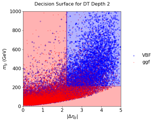
Fig. 61 . Decision Surface of a decision tree of depth 2.
Scikit-Learn#
Call it again with the tree of depth 20.
5.2 Comment#
Comment on the decision surface with the deep tree: what is happening? How to cope?
6. The Forest#
Let’s plant a forest now. We need the following imports:
from sklearn.ensemble import RandomForestClassifier
from pprint import pprint # 'pretty printing', for listing the parameters
6.1 Default Random Forest#
Create a random forest with the defaults Scikit-Learn settings and print the parameters.
6.2 Number of Estimators#
How many estimators is the random forest made of?
6.3 Plot the Decision Surfacee#
Call your macros to plot the decision surface. How does it compare with one tree of depth 20?
Optional: you can plot the ROC curve of your forest classifier and compare with the tree ones. More on ROC curves at the end.
6.4 Forest with Max Depth of 5#
Create and plot the decision surface of a forest with 100 estimators and a max depth of 5 for each. Does this show some improvement?
7. Green Boost#
Let’s now boost! Recall the demo in Lecture 4. We will take 10 estimators of maximum depth 2:
from sklearn.ensemble import AdaBoostClassifier

ada_clf = AdaBoostClassifier(
    DecisionTreeClassifier(max_depth=2),
    n_estimators=10,
    algorithm="SAMME.R",
    learning_rate=0.5)

ada_clf.fit(X_train, y_train)
Comparison With Other Classifiers
How does it compare with the other classifiers? See it on the decision surface!
8. Bonus: overlay ROC curves#
We plotted a ROC curve for each tree and random forest. It is convenient to overlay the ROC curves on the same graph to easily compare classifiers. For this, you can modify your ROC curve macro to loop over a dictionary of classifiers. Such a dictionary can look this way (example, you can code it differently of course):
clfs = [{'clf': tree_clf_depth2,  'name': 'Decision Tree Depth 2' ,                   'color':'brown'},
        {'clf': tree_clf_depth20, 'name': 'Decision Tree Depth 20',                   'color':'coral'},
        {'clf': RF_100est,        'name': 'Random Forest 100 estimators',             'color':'greenyellow'},
        {'clf': RF_100e_d5,       'name': 'Random Forest 100 estimators, max depth 5','color':'yellowgreen'},
        {'clf': ada_clf,          'name': 'AdaBoost 10 estimators, max depth 2',      'color':'green'}
]
∞. Bonus of the Bonus#
If you manage to do everything above and are starting to get bored, come to me, I will give you a challenge.
Appendix: T4 Snippet Zone#
ROC Curve#
def plot_ROC_curve(clf, label_leg, X, y_obs, class_index):

  fig, ax = plt.subplots(figsize=(6, 6))

  # Luck line
  ax.plot([0, 1], [0, 1], color="navy", lw=2, linestyle="--")

  # Get proba predictions:
  y_scores = clf.predict_proba(X)

  # Getting the ROC curve values
  fpr = dict() ; tpr = dict()

  #_____________________________

  # Your code here (2 lines)

  #_____________________________

  ax.set_xlim([0, 1]) ; ax.set_ylim([0, 1])
  ax.grid(color='grey', linestyle='--', linewidth=1)
  ax.set_xlabel("False Positive Rate")
  ax.set_ylabel("True Positive Rate")
  ax.set_title("ROC Trees", pad=20)

  # Legend and plot:
  ax.legend(fontsize=FONTSIZE, bbox_to_anchor=(1.04, 0.5), loc="center left", frameon=False)
  plt.show()
Decision Surface#
def get_decision_surface_xyz(clf, inputs, x_lims, y_lims, step):

  # Create all of the lines and rows of the grid
  xx, yy = np.meshgrid(np.arange(x_lims[0], x_lims[1]+step, step),
                         np.arange(y_lims[0], y_lims[1], step))

  # Creat dataframe with flattened (ravel) vectors:
  X = pd.DataFrame({inputs[0]: xx.ravel(), inputs[1]: yy.ravel()})

  # Get Z value vectors (ravel = flatten grid in vector)
  Z = clf.predict(X)

  # Reshape Z as grid for exporting
  zz = Z.reshape(xx.shape)

  # Return grid + surface values:
  return (xx, yy, zz)
2.3 Comment your Tree#
Describe what is this representation about. How are the variables encoded in Scikit-Learn? Which direction (left/right) chosen if the condition is true/false? What does the colouring in some nodes correspond to? Where goes the signal, where goes the background? Which leaves are the purest? For which category?