Let’s ROC!
Contents
Let’s ROC!#
There is in machine learning a very convenient visual to not only see the performance of a binary classifier but also compare different classifiers between each others. It is the ROC curve (beloved by experimental particle physicists). Before explaining how to draw it, let’s first introduce key ingredients.
Ingredients to ROC#
Those elements are concepts previously encountered, yet but baring other names: the score and decision threshold.
We saw the classification is done using the output of the sigmoid function and a decision boundary of \(y=0.5\) (see Definition 17 in section What is the Sigmoid Function?). Sometimes the classifier’s output is also called score, aka an estimation of probability, and the decision boundary can be also referred to decision threshold. It’s a cut value above which a data sample is predicted as a signal event (\(y=1\)) and below which it is classified as background (\(y=0\)). We chose \(y^\text{thres.}=0.5\) to cut our sigmoid half way through its output range, but for building a ROC curve, we will vary this decision threshold.
Now let’s recall (pun intended) the True Positive Rate that was defined above in Definition 30, but let’s write it again for convenience and add other metrics:
Definition 32
True Positive Rate (TPR), also called recall and sensitivity
True Negative Rate (TNR), also called specificity
Ratio of negative instances correctly classified as negative.
False Positive Rate (FPR)
Ratio of negative instances that are incorrectly classified as positive.
The False Positive Rate (FPR) is equal to:
We have our ingredients. So, what is a ROC curve?
Building the ROC curve#
Definition 33
The Receiver Operating Characteristic (ROC) curve is a graphical display that plot the True Positive Rate (TPR) against the False Positive Rate (FPR) for each value of the decision threshold \(T\) going over the classifier’s output score range.
Let’s unpack this. First, recall the logistic function in classification. As input, we have the mixture of the input features \(\boldsymbol{x}\) with the model parameters \(\boldsymbol{\theta}\) (in the linear case, it is a simple dot product, but let’s be general here: it can be any combination). The output of the sigmoid is the prediction, or score. After training our model, we can use the validation dataset that contains the true labels to collect for each class, signal (1) and background (0), the predicted scores. Then it is possible to draw two distributions from those scores, as seen in the schematics below on the left:
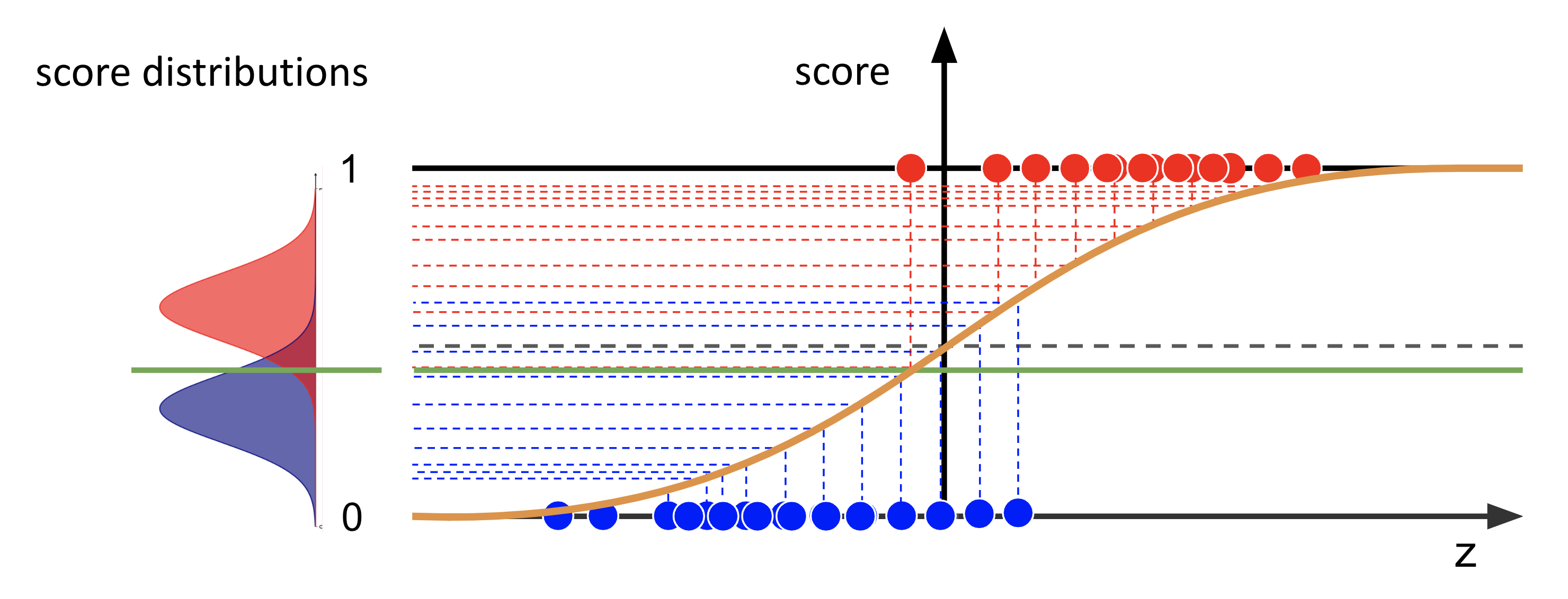
Fig. 17 : The logistic function predicts scores for two classes, the background (in blue) and the signal (in red). The distributions of the scores are shown on the left as two normalized smooth curves.
Image from the author#
In the previous lecture, the decision boundary is illustrated as an horizontal line on the sigmoid plot. In the distribution of the scores, it is now a vertical threshold. In other words: what is predicted signal, i.e. data points whose scores are above the decision boundary, is now the integral of the scores on the right of the threshold. And what is predicted background, scores below the decision boundary, correspond to the integral of the curves on the left of the threshold.
As these score distributions overlap, there will be errors in the predictions!
Let’s see it closer:
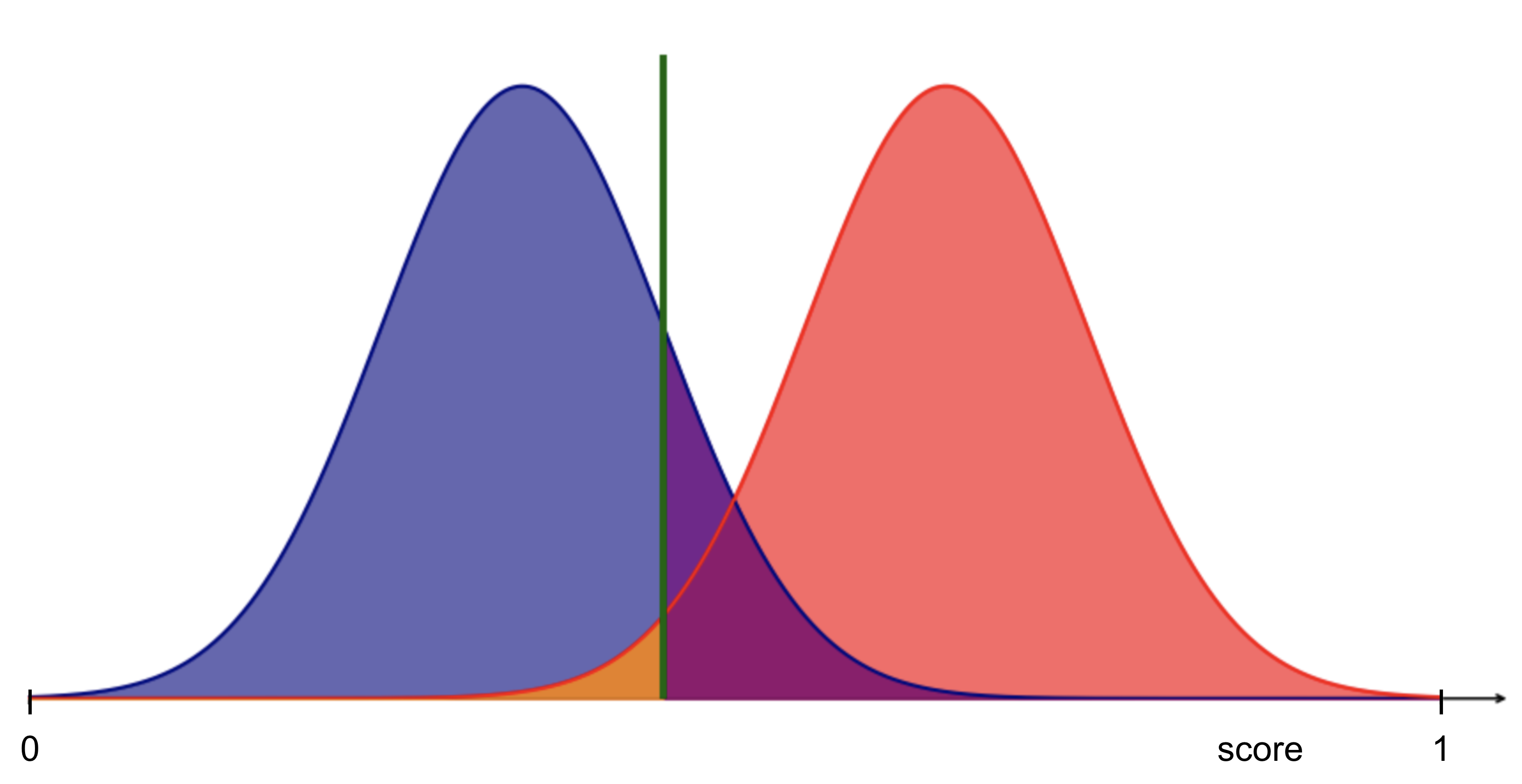
Fig. 18 : Overlapping distributions of the scores between our two classes means prediction errors.
Image from the author#
Exercise
From the figure above, identify where are the True Positives, True Negatives, False Positives and False Negatives.
Check your answer
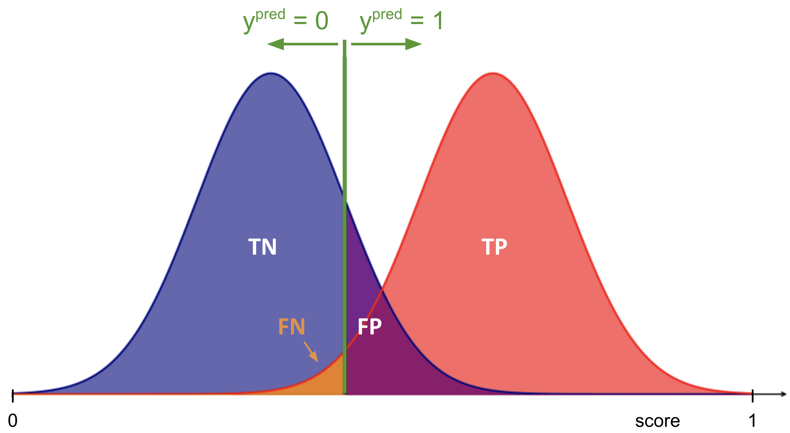
Fig. 19 : Score distributions of background (blue) and signal (red) and the predictions from a given threshold (green vertical line). More explanation in the text below.
Image from the author#
True positives correspond to all the data points from the signal class integrated from the right of the threshold.
Inversely, true negatives correspond to all the data points from the background class integrated from the left of the threshold.
False positives are real background samples incorrectly predicted as signal (purple area from the background distribution).
False negatives are real signal samples incorrectly predicted as background (orange area from the signal distribution).
For a given threshold, it is possible to compute the True Positive Rate (TPR) and False Positive Rate (FPR). The ROC curve is the ensemble of the points (TPR, FPR) for all threshold values.
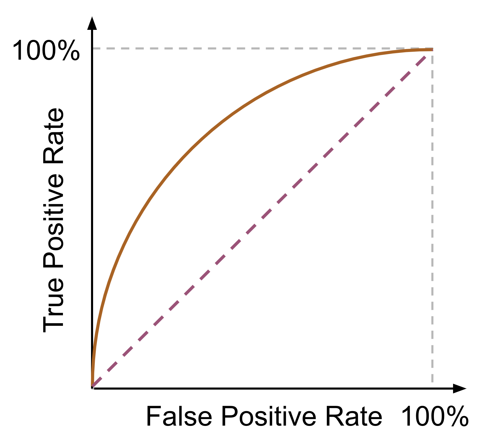
Fig. 20 : ROC curve (dark orange) illustrating the relationship between true positive rate (TPR) and false positive rate (FPR). The dashed diagonal line represents a random classifier.
Image from the author#
Exercise
If we move the threshold to the right (\(x \to +\infty\)), in which direction would it corresponds to on the ROC curve? Right or left?
Check your answer
If we move the threshold \(T\) to the right, we will omit some signal samples (\(y=1\)) and thus decrease in signal efficiency, so the True Positive Rate will decrease (and if we exagerate to check this reasoning by pushing \(T\) to the very very right, we have no more signal sample on the right of the threshold, we miss out all signal and TPR = 0). So moving to the right decreases the signal efficiency/TRP.
What about the background (\(y=0\))? It’s the contrary, if we shift the threshold \(T\) to the right, we will gain more background samples in the blue distribution and improve our background efficiency. Good for the background, but we want signal. That translates on the ROC curve in reducing the FPR (1 - background-efficiency). And we can check that if the threshold is all the way to the right, we have 100% background efficiency (all samples we take on the left are real background and predicted as background, aka TNR = 1) and a specificity of 100%.
Conclusion: increasing the decision threshold \(T\) moves us on the ROC curve to the left (and down eventually to 0,0).
Comparing Classifiers#
The ROC has the great advantage to see how different classifiers compare through all the ranges of signal and background efficiencies.
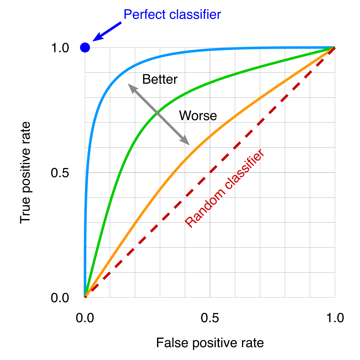
Fig. 21 : Several ROC curves can be overlaid to then compare classifiers. A poor classifier will be near the “random classifier” line or in other words using pure luck (it will be right on average 50% of the time). The ideal classifier corresponds to the top left dot, where 100% of the real signal samples are correctly classified as signal and thus the False Positive Rate is zero.
Image: Modified work by the author, original by Wikipedia#
We can see from the picture that the more the curve approaches the ideal classifier, the better it is. We can use the area under the ROC curve to have a single number to then quantitatively compare classifiers on their overall performance.
ROC curves can differ depending on the metrics used. In particle physics, the True Positive Rate is called signal efficiency. It is indeed how efficient the classifier is to correctly classify as signal (numerator) all the real signal (denominator). Zero is bad, TPR = 1 is ideal. The True Negative Rate is called background efficiency. Particle physics builds ROC curves slightly different than the ones you can see in data science; instead of using FPR it uses the background rejection, defined as the inverse of background efficiency. All of this to say that it’s important to read the graph axes first!
Definition 34
The Area Under Curve (AUC) is the integral of the ROC curve, from FPR = 0 to FPR = 1.
A perfect classifier will have AUC = 1.
While it is convenient to have a single number for comparing classifiers, the AUC is not reflecting how classifiers perform for specific ranges of signal efficiencies. It is always important while optimizing or choosing a classifier to check its performance in the range relevant for the given problem.